

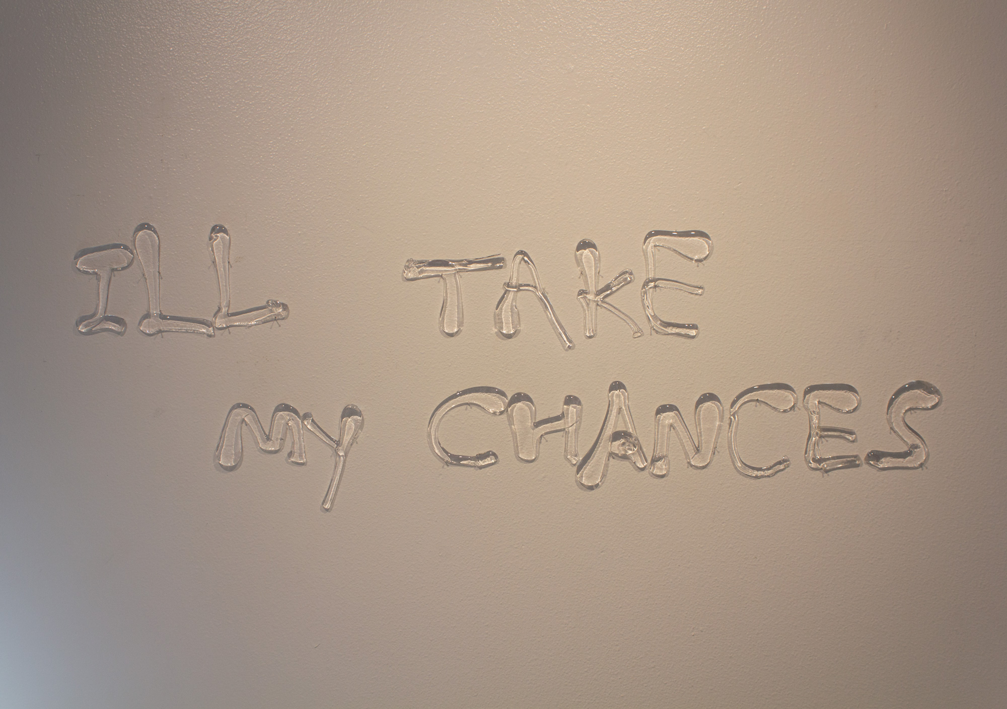
Kay Seedig, “I’ll Take My Chances,” hand ladled glass, on view at the Latino Cultural Center
Someone, like me at the Latino Cultural Center, June 18–August 13, 2022
This exhibition, curated by Angela Faz, seeks to present contemporary art that examines “queerness beyond rainbow capitalism.” In this show, the masculinity that dominates much of queer culture is left out to make room for presentations of femme narratives, or rather, the queer spectrum more broadly. Kay Seedig’s work I’ll Take My Chances consists of the title written in hand-ladled glass, which has cooled into hardened individual letters that are pinned to the wall. Glass is heavy, and writing even a short statement, one letter at a time, by drawing with molten glass is an undertaking that requires stamina. The work, much like the rest of the show, is an action of taking up space, being heard, and going against the grain.
****
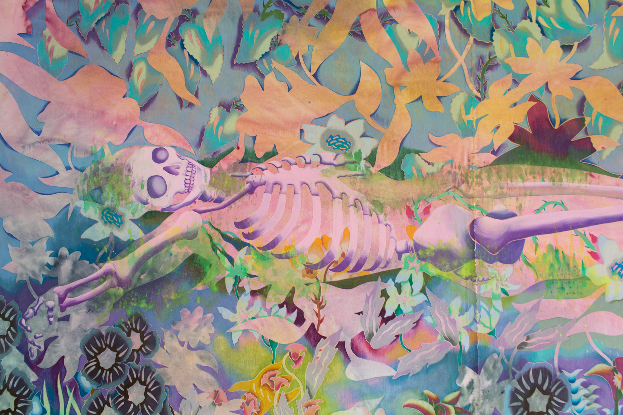
Sarah Ann Weber, ‘Their perfume lost,’ 2022, Acrylic, watercolor and colored pencil on paper, mounted on linen over wood panel, 72 (H) x 96 (W) in
Sarah Ann Weber: The first green light of the sun at 12.26, June 4–July 30, 2022
Sarah Ann Weber’s show almost reads as an extended version of Sir John Everett Millais’s Ophelia, albeit with more psychedelia. In one work, I would give you some violets (2022), a blue skeleton lays on its back amid a menagerie of foliage. The painting’s hues range in grand washes of watercolor, and flowers seem to be planted in the sky. There is less of an emphasis placed on botanical accuracy, and more of a general sense that the painted and drawn gardens grow in a mythical eden. The scenes have no discernible living figures; most of the content of this show is plant life, which consumes all visible space. The vegetation is a welcome respite from the hot parking lot that sits right outside the gallery.
****
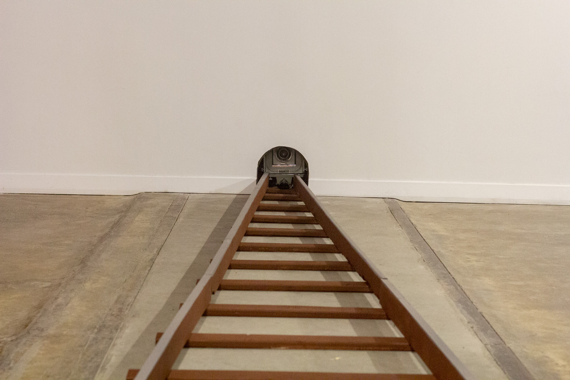
Hadi Fallahpisheh, installation view of “Young and Clueless,” on view at the Power Station
Hadi Fallahpisheh, installation view of “Young and Clueless,” on view at the Power Station1
Hadi Fallahpisheh: Young and Clueless at the Power Station, Currently on view, opened April 20, 2022
Hadi Fallahpisheh’s show at the Power Station is a recollection of childhood paranoia. Stuffed teddy bears flounder around their respective sculptural works, and light paintings (made by exposing photosensitive paper with lights and color gels in a darkroom) are blinding. The shadowy silhouettes of a cat and mouse greet the viewer from a barred up gallery window.
The Power Station is not usually a place where paintings are hung and left to speak for themselves; as such, this show has many modes from which to articulate the sense of a compromised home. The upstairs balcony gallery features a light painting with a mouse kneeling before a windmill, which is a shocking cyan hue. A miniature railroad installed on the floor gives off the forced perspective of the rail descending into the distance. The space’s windows have been prepared with plastic sheeting, which echoes the color gels used in Fallahpisheh’s paintings. Be sure to look everywhere in order to piece the fable together.
****
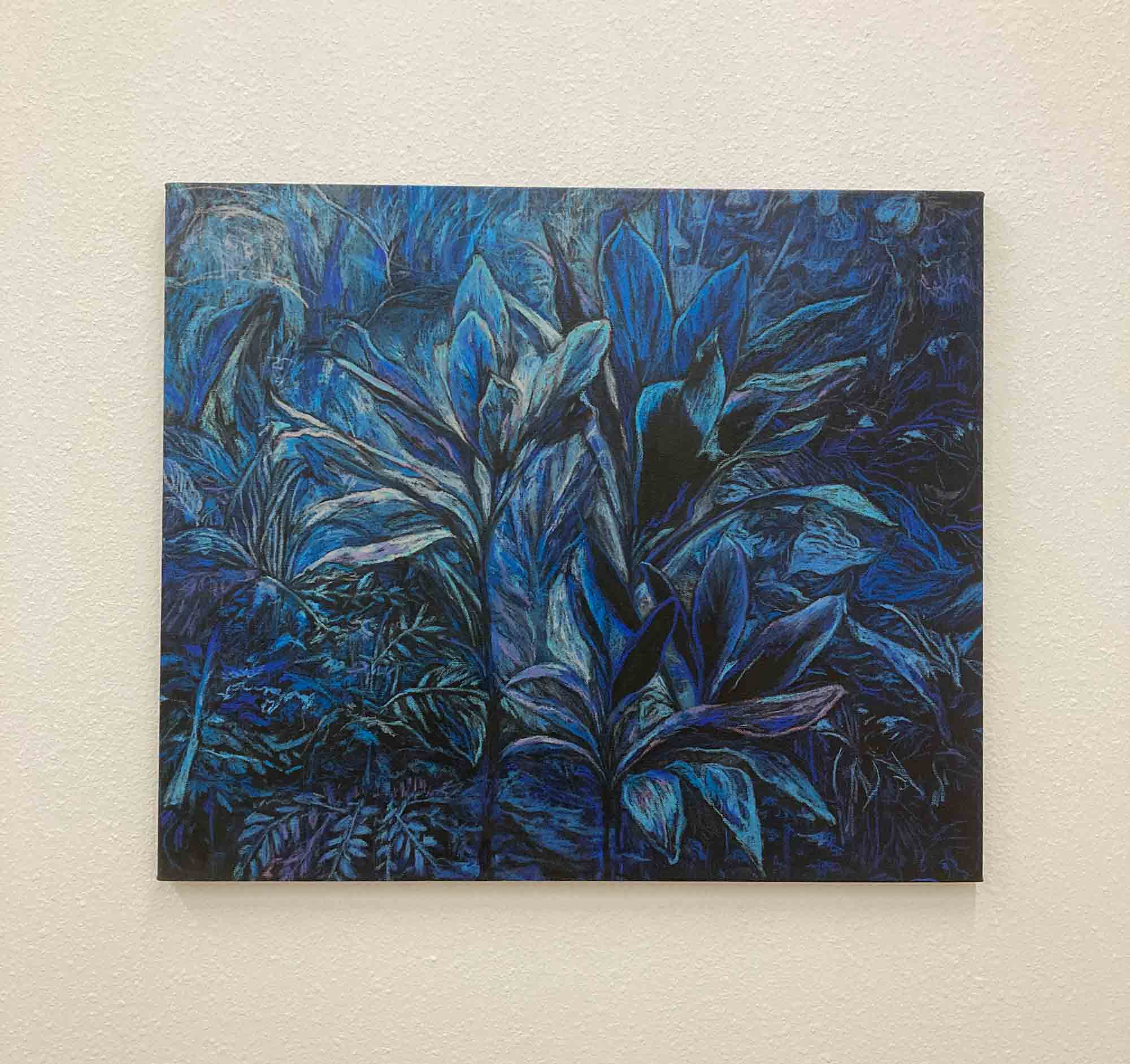
Tobe Kan Kiu Sin, “Shift 3,” 2020, oil pastel on canvas, approx 23.4 x 27.6 in (59.5 x 70 cm)
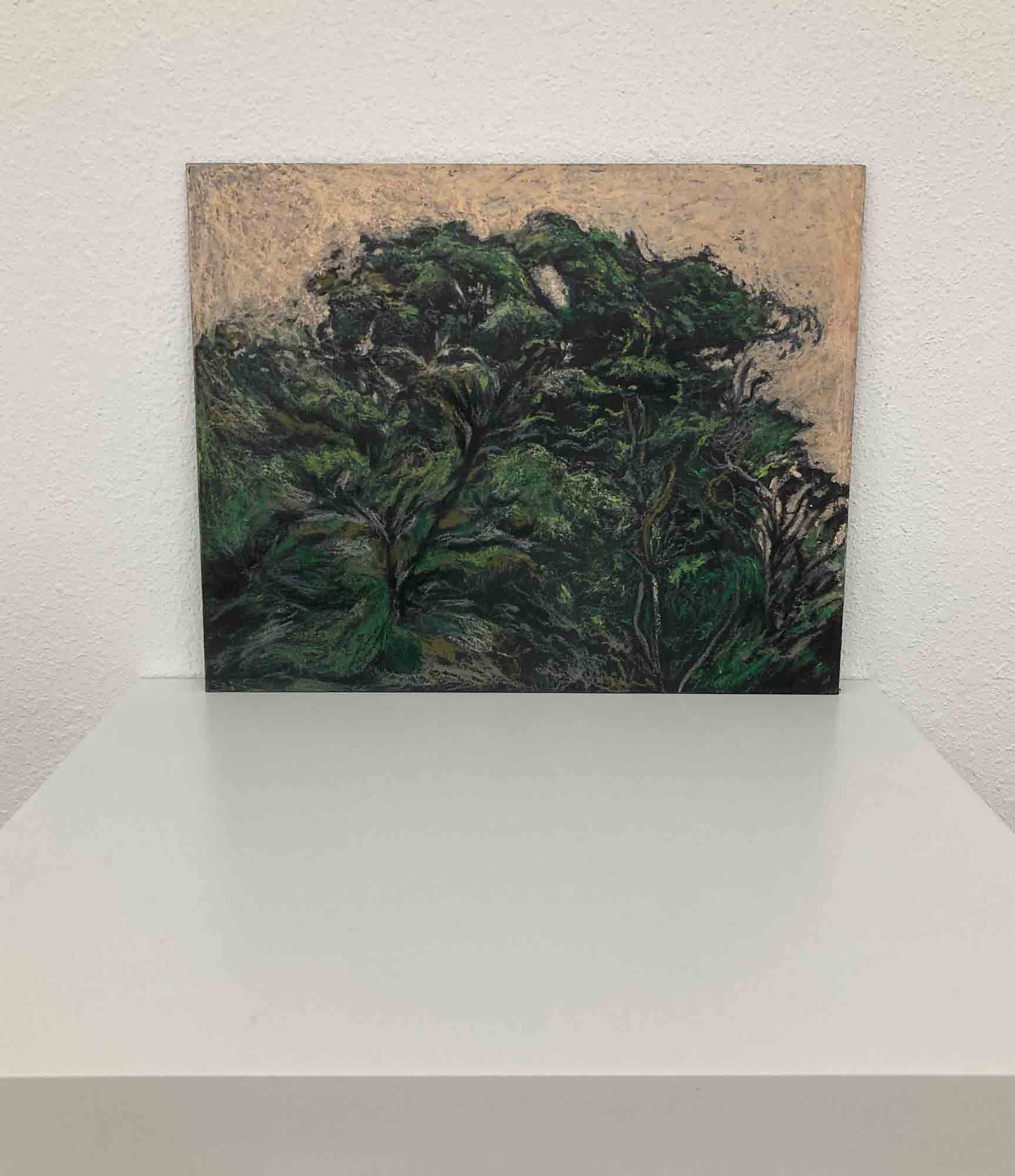
Tobe Kan Kiu Sin, “Asleep 21,” 2019, oil pastel on cardboard, approx. 9.8 x 7.8 in (20 x 25 cm)
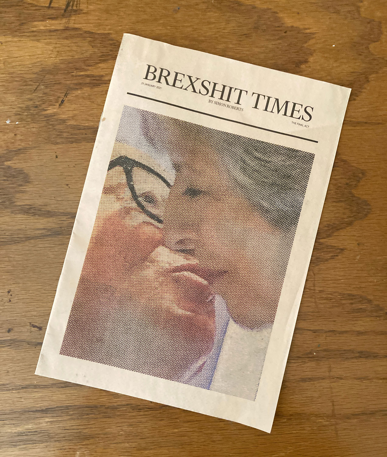
Simon Roberts, “Brexshit Times,” short run publication, on view at Peter Augustus
Tobe Kan Kiu Sin: of war, of love, of time at Peter Augustus, May 21–June 25, 2022
Tone Kan Kiu Sin’s oil pastel paintings are executed on black-clad canvas and board, which acts as a much more dramatic ground than traditional white canvas. Also in the space are various plants seated upon square plots of dirt, left to carry out their life cycles as best they can in the artificial environment of the gallery. The artist’s paintings feel something like plein air depictions of tropical plants, but they are cold in hue. Despite Sin’s use of oil pastels, these works resemble a dry-brush technique, as the color is lightly applied and reveals an inconsistent surface to the works. Kan Kiu hails from Hong Kong, and their paintings feature those plants native to the region. The greenery on the floor of the gallery, by contrast, is sourced locally, and will not live as long as their painted counterparts. While I think it is cliché to say that an artwork is about death simply because it does not cheer brightly for the future, I don’t think it is too much for us consider a question of location: where is this square, this plot, this land?
Additionally on view at the gallery during my visit was Brexshit Times, a short-run publication by Simon Roberts that features instances of the word “Brexit” used by the press, combined with other words; as in Brexiled or Brexhausted. The publication, color-coded in such a way to emulate the Financial Times, touches on the news cycle’s colorful approach to labeling political shifts, and the English-speaking world’s difficulty grasping change.
All photos by William Sarradet unless otherwise stated. William Sarradet is the Assistant Editor for Glasstire.
